Rediscovering PowerPoint classics: the Gettysburg presentation

More weekend reading. 
Peter Norvig is Director of Research at Google. Back in 2000, being fed up with boring PowerPoint, he decided to use a famous speech by President Lincoln to demonstrate how a poorly designed PowerPoint translation could destroy its communication power completely. He put the creative "master piece" on his web site and more or less forgot about it. 
Gettysburg address
View SlideShare presentation or Upload your own. (tags: gettysburg lincoln)
Today (November 2008), the "Gettysburg PowerPoint presentation" still comes out #4 on a Google search for "powerpoint presentation". (Check also "the making of" page)

Brilliant visualization of a "real word" design user interface

Weekend reading (1 day earlier than the rest of the world in Israel). I stumbled on this great ad for Adobe Photoshop CS4. It shows what graphics and presentation design is all about, a creative process working with shapes and colors and a blank piece of paper. Computers make it easier to work, but in our mind we should go "back to basics" now and then. Go to this Flickr stream for more detailed/hi-res images. Agency Bates141. Via Zurb.

Create a Twitter background using PowerPoint

There is a lot of (white) space for self expression on Twitter in its background image. (Not implying that "cluttering it up" will make it look better though) The "The Closet Entrepreneur" posted a tutorial how to create a Twitter background in PowerPoint. It includes a template with the areas you should leave blank for Twitter's own content. P.S.: follow me on Twitter. Via Digital Inspiration

Source file of the bouncing PowerPoint equalizer now online

I have put the source file of the happily dancing equalizer in PowerPoint now online. I uploaded it to Slideshare, you can see the animations if you download the presentation (a PPS file), the regular SlideShare embed does not support it.

Improve your looks in a picture - automatically!

Israeli scientists have not only found a way to specify human beauty mathematically, they go a step further to develop a tool that automatically improves your looks in a picture. Not sure when this will be added to the PowerPoint format ribbon...
Project page here, found via Haaretz. An earlier post about face "recognition" here.

Reviewing the SlideShare financial crisis presentation contest winners

The winners of the SlideShare presentation contest about the financial crisis were announced a few days ago.
  • My general point about SlideShare-style presentations being great for online viewing but not always the best solution for live audiences still stands.
  • The content of the winning presentation is not surprising, most of us will have picked up the messages from the newspaper. It is a shame that none of the winners used visualization of data from original analysis to give us a really new insight in the subject matter.
  • It is great to see how contests like these can spark so much creativity in people submitting their work. 
Having said that, let's discuss the graphical execution of the winners:
The winner:
I like this presentation, especially the use of images (the historical paintings look great, the falling knife almost makes you feel the pain in your own hands.)
Number 2:
Not judging the content here, I like the execution of this presentation less. The link between the text and the images is not that strong. 
Number 3:
UPDATED. While I generally do not like simple graphics like clip art in presentations, this presentation uses this technique beautifully. All graphics are custom-made. They have a consistent style, and the "simplistic" graphics provide a good tongue-in-cheek contrast to the really complicated subject matter and the whole thing hangs together well.

Chart concept - using cinematic effects to provoke real audience emotions using PowerPoint

A combination of big (sometimes huge) projector screens and high-quality images creates an opportunity for (PowerPoint) presenters to enter the arena of the movie director to provoke real emotions in the audience.
  • A bright light or a beaming sun beaming right at us, although there is no risk of dammage to our eyes we intuitively squint
  • A sudden pop up and disapearing of a big spider ("booh", never used this one though)
  • A gun pointing at the audience (or less dramatic: a remote control zapping you away)
  • Large close-up of eyes (beautiful, innocent, scary)
  • Nails and a blackboard (makes you feel the chart)
  • Looking down a roller coaster track, training coming at you, base baller about to hit a ball
  • The list can go on
Image purchased from iStockPhoto.

Great visualization of people connecting on Facebook

See the video here. Full details in the original post on TechCrunch. Update: if you like these type of visualizations, Mashable has a whole stack of them, including videos, in this post.

McKinsey interviews Gartner CFO on communicating with investors

Presentations to analysts and investors are very important for publicly traded companies: they have a direct impact on the share price.
In this interview for the McKinsey Quarterly, Gartner CFO Christopher Lafond lays out his investor relations strategy:
  • Segment and prioritize investors you want to talk to (in his case funds that have a long-term interest in Gartner, and do their homework to understand the fundamentals of the business)
  • Focus on a very limited number of performance metrics, not shying away from internal, operational metrics that are usually only discussed by management
  • Educate investors why these are important
Note: (free) registration to the McKinsey Quarterly might be required to read this article.

A "Google Chrome-style" comic novel about the pioneer behind the laptop

Steve Hamm is a writer for Business Week who is about to publish a new book: The Race for Perfect: Inside the Quest to Design the Ultimate Portable Computer
Joe Lambert produced a graphic/comic version of chapter 4 of the book, about the development of the laptop and the contributions of Alan Kay, one of the main visionaries of mobile computing. Alan worked on a number of very important innovations: the graphical user interface and the mouse, the portable PCs, and the PDA just to name a few.
I think that the illustrations are beautiful, and the story is really interesting. However unlike the case of Google Chrome, I do not think that the comic format does a lot to add to delivering the message of this book. Neither Joseph Lambert nor Steve Hamm are to blame (on the contrary the art work and the story are great). The Google Chrome book confirms that comic graphics can do a great job of explaining complex technology. A historical time line simply leaves less room for creative expression. For more about Alan Kay and his ideas see this video at TED, the source of my inspiration for this blog post.

Sending files up to 2 GB - yousendit adds Microsoft Office plugin

Big PowerPoint files are becoming an increasingly big problem. Yousendit is a convenient service that allows you to send very large files. You upload a file to the server, the recipient receives an email with a link to download it. FTP without the hassle.
Today, yousendit launched a plugin for Microsoft Office. It's the same functionality that the web site offers, but now with a tighter integration into Excel, PowerPoint and Word.
Be aware of security issues though. If you use the standard transfer mode, anyone "guessing" the download URL can get to your file. Secure sending options are available but are not free of charge.

You don't have to be dyslexic to benefit from these presentation design guidelines

Reading through a web site with guidelines for designing web pages for dyslexic users, I realized how valuable these recommendations can be for any audience, not just people with this condition. 
This is a PowerPoint presentation design guide 101:
  • Choose a big, san-serif font
  • Avoid capitalization
  • Apply a calm background, no watermarks
  • Don't righ-justify text
  • Minimize use of italics
  • Keep things short, write in a simple style
  • Use bullets (if you have to), don't write proze
  • Refer to the reader as "you"
  • Stick to narrow columns, text lines
  • Use pictures

A new source of vintage images: LIFE (now hosted by Google)

Google has just put the massive archive of images from LIFE magazine online (Google blog post). The majority of which never made it to print. Google will ultimately scan in the entire collection of about 10 million images. Large-format print can be purchased.
Another example of how online media is unlocking the "long tail" of historical information.
This opens up a great new source of vintage images for use in PowerPoint presentations. They are very hard to find (stock image sites hardly list them).
Wide range of facial expressions on children at puppet show - The moment the dragon is slain, Guignol puppet show, Parc de Montsouris, Paris, 1963. Photographer: Alfred Eisenstaedt
I like using vintages images:
  • Non-disturbing, neutral B&W colors
  • Iconic images that have become part of our common culture can get a point across quickly
  • It provides a nice conctrast, especially when used in presentations on high-tech subjects
  • There are some good examples of concepts that can be explained using vintage images: i.e., the old grocery counter is a much better visualization than a cliche image of a smiling call center rep.
  • Vintage images can get across raw emotion, like the image of the children above, much better than searching a stock image site for "happy children"
To search images from the LIFE archive, simply add "source:life" in your Google Images search bar (example: search results for Picasso)

Seth Godin on "Blah, blah, blah, blah..."

No audience member [...] has ever said, "it was exciting, useful and insightful but far too short."
Read the full (short) post.

Great visual - you can almost feel the headache

I am adding adgoodness to my blog roll. This is another great find.

Data visualization - correlating 2008 election and 1860 cotton production

The issue of race and the 2008 U.S. presidential election sparks big discussions everywhere, I am staying out of this here. This blog is not about politics. From a presentation point of view, the election offers some interesting data visualization opportunities. Maps can be powerful presentation tools. Via strange maps, which also has a chart overlaying the 2 maps. I actually think that visually, leaving the 2 charts separate looks better, keepin the ancient look and feel of the 1860 map intact.

Nokia E71 - great phone, screen graphics could be more "Zen"

My wife had to swap her mobile phone because my 2 year old son decided to empty a bottle of water on her previous one. These things happen. The new phone is a Nokia E71. Phone reviews are a bit out of the scope of this site (it is a great phone by the way), but I can comment on the graphics of the user interface.
Nokia could have done so much better:
  • Like almost all mobiles, there is a busy wall paper crowding the display
  • Overly sophisticated icons with random colors
  • Different font (sizes), poorly aligned.
Mobile phone screens can also benefit from a "Zen" make-over to transform them into calmer and more minimalist user interfaces
PowerPoint and mobile phone interfaces are the same: the fact that you can make that sophisticated watermark background does not mean you have to use it!

Gary Vaynerchuk - passion / no PowerPoint

Somehow I only recently started to follow Gary Vaynerchuk who built a great personal Internet brand through "live" wine tasting sessions recorded to video (most wine critics taste offline and publish later online or in newspapers). This despite being reasonably hooked up to social media, and - more importantly - being a wine enthusiast. Anyhow, better late than never.
I stumbled on one of his presentations (September 2008):
A very passionate presentation. Not a single PowerPoint slide here. Very memorable and entertaining. Still, (a very small "still"), you can see that Gary is used to presenting to a video camera, rather than to a live audience. But he is forgiven, I will seek out more of what he has to say.
His messages in this video:
  • Stop doing anything you do not want to do, but do something you are passionate about right now and go all the way, give it your full shot
  • Build your brand and presence on every tool you possibly can find
  • Realize that you are building your legacy now: this is the first generation that will experience that anyone can see everything you ever did, forever (including your children whom you want to be proud of you)
  • Connect, interact with people to succeed

Great visuals - "maybe it's time to move on"

These ads do a great job in visualizing a state of mind (maybe in the current situation, people have less of these thoughts though). These type of images are good ice breakers in a presentation, but because they attract so much attention, I would follow with a black/white empty screen afterwards to get the attention back on you, the presentator.
The site careerbuilder.com seems to be down though... Via Fubiz.

Showers - why they spark creative ideas

Designing presentations is a creative process. Churning out slides and racing towards the deadline will not give the best results. I like to think about a presentation, let it rest, think about it again, drop it again to nurture the best creative ideas.
While reading this post on Cameron Moll's blog I discovered that there is a scientific name for this, the creative pause: the time between the moment you stop actively thinking about a problem and the time the solution pops in your head unexpectedly.
Cameron goes further to analyze why taking a shower can help closing this creative pause:
  • Minimal distraction
  • Minimal mental strain
  • White noise
  • Change of scenery
All valid points (going on a bike ride or excercise in general creates a similar environment). One addition: people tend to take showers in the morning, I think that that long night of sleep with your subconscious mind griding away might have made the biggest contribution to cracking that difficult issue.

Balsamiq: visualizing software using a mockup - quickly

What a nice story on Read Write Web today. Someone quits his job, starts writing software, and has already made $100,000 in revenues in 5 months. The idea behind Balsamiq is interesting: provide a tool that can quickly create a mock up of software or a web site. Not only useful to nail down a software specification among a group of engineers, but probably also handy when you want to communicate/visualize a very early startup idea to potential investors when you do not have a prototype or demo ready yet.
More background reading on demos: David Rose advises never, ever, to use a live demo in a pitch presentation, and an earlier post on presenting software interfaces in PowerPoint.

Injecting a designer's personal touch into a presentation

All presentations I design are used by others - not me
All presentations I design have a serious, professional subject
Still, I like to add a personal signature to my work. How can you do that within the constraints of the presentation other than the little reference in 8pt font on the last page?
As a designer you can steer the choice of visuals you use with things you are passionate about:
  • When you need an urban street image: take one from Paris, even better Boulevard St. Germain, even better people sitting outside Cafe de Flore...
  • When you need to express harmony use a black and white image of Miles Davis playing a away...
  • When you need to visualize something agile and fast, take a bright yellow Mini car...
  • When you need a newspaper cover, take one from a memorable date...
  • The list can go on and on...

Picking a background color for a PowerPoint presentation

Some observations on setting the background color for your presentation:
  • Whatever you choose, it should be a plain background without watermarks, logos or shapes. The audience is interested in the content of your slides, not the artwork in the background
  • You have a choice of something dark, or something light. Different presentation settings, benefit from different background colors, see a previous post. (The 2 extremes: a big-audience-keynote is usually dark, a small meeting usually light)
  • In principle, any dark or light color could work. But, watch out for light "pastel" colors that come out ugly on (poor) color printers or overhead projectors. Also think about working with stock images, there are plenty of images with white or black backgrounds that blend easily into the background, finding one with the perfect marine blue might be more challenging.
  • Especially with dark backgrounds, it can be elegant to add a tiny gradient to the color, making the bottomo of the screen 1 shide lighter. You create an effect similar to the color of the sky after the sun just went down.

Visualizing your consumer and/or audience makes it real

Using a good image is the best way to describe something as complex as a consumer segment. Putting a page loaded with bullets: young, Asian, affluent, female, confident, well-educated on a piece of paper does not get the message across. A picture does the trick: hey, here she is!
Finding good, non-cheesy, non-artifical-model images is a challenge though.
Visualization of a person is helpful in another way: preparing your presentation. Putting up that picture of a "typical" CIO of a medium-sized company might put you in the right "mood" to fine tune that important sales presentation for 200 blade servers. The picture itself of course will never make it into the final presentation (it might if the audience has a sense of humer, but it is extremely high risk).
Our Asian consumer image was purchased on iStockPhoto.

Sometimes breaking PowerPoint rules can be a good thing

See this chart:
It breaks a number of rules. The most obvious one is the bar towering out of the chart frame. But hey, it helps make the point!
Original chart can be found on PHD Comics. I found it on Junk Charts
UPDATE: this chart does violate some other basic design rules that are better corrected, see an earlier post about cleaning up Excel/PowerPoint data charts.

Why SlideShare will turn into a major platform for spreading ideas

More and more I come to the realization how online presentation sharing tools such as SlideShare will become one of the main platforms to spread ideas.
  • An image says more than a 1,000 words. Long pieces of text do not work for an impatient Internet audience suffering from information overload. Short blog or Twitter posts cannot capture complex concepts. LOOK AT THIS SHORT POST AND MANY PEOPLE WILL ALREADY DECIDE IT'S TOO LONG TO READ
  • Images are a pain to manage in HTML, especially when you want to add text, shapes, etc. SlideShare makes it easy to put up a sequence of images. Slideshare makes it easy to embed, share this.
  • Presentation Zen ideas about good presentation graphics are spreading into the mainstream: more and more people know how to leverage presentation software correctly
  • SlideShare enables some remote "flow control". People click frantically, but follow the script better than when scrolling down a column of text only eye balling bold words, or abandoning a YouTube (or TED) video mid-way
Remember, a good SlideShare presentation is not the same as a presentation for a live audience. See my earlier post on Not all presentations are "Zen".
  • A SlideShare audience is as impatient as any, but it does not sit in a room where it is impolite to walk away mid-presentation. Every slide should invite watching the next one.
  • People watch SlideShare presentations on a very small screen, like sitting in the back of a huge conference room: large images, big fonts are even more important
  • Animations (not a great idea anyhow) do not work (yet) in SlideShare
  • No presenter. You cannot explain what's in the slides. They have to be crystal clear, messages have to be more explicit/spoon-fed than you would do in a live presentation

How people really use the iPhone - case example of presenting consumer research in PowerPoint

An interesting presentation on SlideShare, a consumer researh firm createwithcontext presents the research results about how people do use the Apple iPhone and its user interface:
Interesting on multiple levels:
  • The content itself, how people use/get used to a new user interface (beyond the scope of this blog)
  • The presentation of the results of the research: a series of screen shots with big arrows highlighting key messages. A format I often use to present screen shots of applications in PowerPoint.
This confirms how I think consumer research results in general should be presented: real images of products, of store interiors, preferrably with direct quotes from the research. "There is a book here, does that mean you can read?", rather than "Focus group members did not understand the meaning of this book icon". Conclusions do not have to be spoon fed, but rather readers benefit from digesting the raw results as if they were sitting behind the mirror of the focus group themselves.

Double productivity - upgrade to a 24" (or more) monitor

The best hardware purchase decision I have made over the past year. Large computer monitors are not a toy or an executive perk anymore but a real boost of productivity.
  • Easier to design PowerPoint slides with big images
  • Space to open multiple applications and copy things across (Excel data into a PowerPoint bar chart)
  • No need to print - easy to read facing pages of A4 (Word, PDF)
  • No need to print - dozens of Excel columns open at the same time
  • Building and debugging Excel models in 50% of the time
  • Less strain on the eyes
  • Faster Internet searches
  • Faster search through hundreds of stock images
  • Easier to design slides for the 16:9 screen
I got an Eizo 24", but Amazon stocks many more (referral program links).
I cannot believe that I actually built most of my Excel models at McKinsey on a 13" laptop screen.

Turning PowerPoint shapes into freeform objects

More PowerPoint "how to's" this weekend. ("how to's" - apostrophe abuse alert) A reminder on the PowerPoint Ninja blog today on how to transform built-in PowerPoint shapes into free form objects. Read detailed instructions here.
Drawing free-hand is a challenge. In order to keep some control on where to move corners of the shape I recommend using a drawing grid with a wide spacing (PowerPoint 2007):
  1. Click the "Arrange" button in the home ribbon
  2. Click "Align"
  3. Click "Grid settings"
  4. Click "Snap objects to grid"
  5. Click "Display grid on screen"
  6. In "Spacing" choose a large value

Copying PowerPoint objects and keeping alignment

Copying PowerPoint objects using CTRL-C / CTRL-V or "copy"/"paste" from the menu creates a new object to the bottom right of the original one. Often you want to copy objects horizontally, or vertically aligned. Here is how to do it:
  1. Hold CTRL and SHIFT
  2. Use the mouse to drag a copy of the object (movement is locked horizontally or vertically)
  3. Release the mouse button
Thank you Titus Tielens (see his books on PowerPoint - in Dutch)

Animated ad - cartoons should be used more in PowerPoint

This is an ad for the Detroit Institute of Arts. It has an example of how animated cartoons can support presentations. I should look more into their use, especially for situations that are actually hard to explain in traditional slides: for example the benefits of the product of a new technology startup that is so early-stage that it does not yet have a product demo. More on cartoons in presentations in a post about Google Chrome. Via AdFreak.

TED - Tim Brown on creativity and play

Videos of presentations of the TED conference are released throughout the year. This one just got posted. Tim Brown is the CEO of the "innovation and design" firm Ideo (Prada store in New York). He talks about the (powerful) relationship between creativity and play. In the rush to the deadline, we very often forget that designing presentations is a creative process.
UPDATE: The McKinsey Quarterly has interviewed Tim Brown, read it here.

PowerPoint lessons from consumer advertising

I stumbled across this ad for a Mini. It contains useful lessons for designing a PowerPoint template.

Not all presentations are "Zen" - different formats for different settings

Not all presentation settings are the same. A "Presentation Zen" slide show with stunning images and the incidental word on a slide is great for a keynote, but might be a bit too much to discuss last quarter's financial results. The 50 page deck with bullet point slides might be serve better as a printed business plan than the key communication tool for a 20 minute VC funding pitch. I have tried to describe 6 presentation scenarios and categorized them according to:
  • Whether the  presenter is present or not
  • The amount of detail/data inside the document
Here we go (click image for bigger picture):
  1. The key note is the classical "Zen" presentation. Huge fonts, dark background, few words, large images.
  2. The pitch is similar to the key note, with the difference that it might be shorter, and does contain some more data to answer questions from the much smaller audience.
  3. The meeting presentation is probably done on a light background, and contains much more facts and details. Over-simplified slides with beautiful pictures do not work in the small conference room with people ready to go through raw material. McKinsey and other consulting firm's presentation often fit in this box.
  4. The slideshare (or online) presentation is something relatively new. People see it typically in small windows, i.e., fonts should be big, pictures should be nice. The audience of this presentation is highly impatient, clicking rapidly to reach the end, and aboning your presentation if it is not interesting enough. No animations here.
  5. The email attachment is similar to the key note presentatation with an important difference that it needs to stand on its own, titles need to explain the messages in the charts. Some animation could be used here (sparingly though). Detail is less than the handout.
  6. The handout contains the full detail, the full text. It should be prepared on a white background (people will often print it) and use no animation (again, does not come out in print). For VC pitch situations, the good handout makes the business plan "brick" obsolete (hardly anyone reads these anyway).
The following colorful diagram makes an attempt to visualize the above. A bit busy, the main message is that things are different in each scenario.

Powerful billboards - The Economist filling a train station hall with an ostrich

We can always learn from outdoor billboards. This one's great. Huge but still elegant. Via adgoodness

The pocket projector is coming to an empty white wall near you

Pocket projectors are starting to ship. Two reviews posted within the last 24 hours: the 3M MPro 110 (around $475) and the Epoq EPP-HH01 ($229).
The reviewers' comments suggest that although the devices can be used, it is still early days. Light strength is still relatively weak and resolution is not optimal (especially for text). As a result you need a darkened room, put the device 1-2 meters from the wall to get an image of around 40-50cm.
It sounds like we need some patience for 2 things to happen:
  1. These devices become powerful enough that they can project a bright, big image. Until then, the laptop screen might be better. Maybe a compromise could work. A projector that is as flat/small as a laptop, but not quite pocket size that does meet minimum projection quality requirements.
  2. More interestingly, this technology is incorporated in a mobile phone, providing these devices with a big screen instantly. The first application will actually be a replacement of the mobile phone screen for let's say web browsing without the need for scroll bars, or viewing Microsoft Office documents for private use, or projecting the latest family pictures. Showing presentations to an external audience is still less obvious.

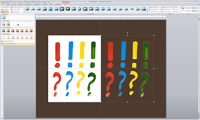
Stripping out the background color of an image in PowerPoint

Adobe Photoshop has professional tools to cut out objects from images. In many cases, setting a transparent color in PowerPoint will do.
In PowerPoint 2007:
  1. Select the image
  2. Go in the "Format" ribbon
  3. Click "Recolor" all the way to the left
  4. Choose "Set Transparent Color" at the bottom of the menu
  5. Click the color that you want to be transparent
The cut out is not perfect and it works best with images with a sharp color contrast. I mostly use it when working with a stock image from iStockPhoto that is an isolated object on a white background. Making the white background transparent gives me more design freedom in PowerPoint.

Chart concept - stage curtains waiting to be opened

Although a bit cliche, I like using an image of a red stage curtain about to be opened. They give a sense of anticipation, look beautiful (nice warm colors, lots of detail), but at the same time focus all the attention on you, the speaker, since there is not that much to look at at the projector. I got the image below from iStockPhoto (referral program link), many other stock photography sites have many, many of them.