
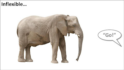
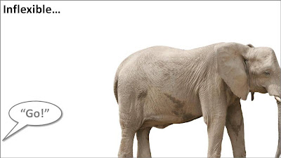
Take the following example. When the elephant is positioned in the middle of the slide, the composition is not really interesting. Have him walk off the page and insert a bit more white space makes it a lot more interesting (our friend just stands there, ignoring all things around him).


Pushing things a bit further, you can use the same technique for words/typography as well. The brain does not always need clean typography to be able to read. You probably remember this text (I do not know who wrote it, or whether the research actually happened):
i cdnuolt blveiee taht I cluod aulaclty uesdnatnrd waht I was rdanieg. The phaonmneal pweor of the hmuan mnid, aoccdrnig to a rscheearch at Cmabrigde Uinervtisy, it dseno't mtaetr in waht oerdr the ltteres in a wrod are, the olny iproamtnt tihng is taht the frsit and lsat ltteer be in the rghit pclae. The rset can be a taotl mses and you can sitll raed it whotuit a pboerlm. Tihs is bcuseae the huamn mnid deos not raed ervey lteter by istlef, but the wrod as a wlohe. Azanmig huh? yaeh and I awlyas tghuhot slpeling was ipmorantt!
An example of letting words "bleed" off the page (I used to highlight problems with current solutions in the market for a client in the technology sector):
 In print, you create bleeding edges by printing on a piece of paper that is too big, excess graphics are cut off later. In the digital world, this is a lot easier: crop the parts of the picture you do not need.