
See the example below of a slide taken from my presentation about fund raising presentations (explaining a bit about my personal and professional background).
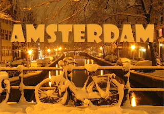 Make sure the direction of the shadow is always vaguely similar to the lighting in the background, the Amsterdam street lights in this case. Use a character color that is similar to the tone of the image.
 Make sure the direction of the shadow is always vaguely similar to the lighting in the background, the Amsterdam street lights in this case. Use a character color that is similar to the tone of the image.