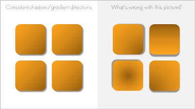
When using drop shadows and gradients, pick an imaginary source of light to guide in which direction you want to put your shadows and/or gradients. And then: use them consistently on the slide and possibly throughout your presentation.

Now that we are on the subject. I am not a big fan of these effects in general. In the example above, I emphasized them on purpose to illustrate the point of direction. Normally, I would use very subtle drop shadows only small chart elements that really need to stand out (
example). Gradients, I use only to simulate a
3D effect.
 Now that we are on the subject. I am not a big fan of these effects in general. In the example above, I emphasized them on purpose to illustrate the point of direction. Normally, I would use very subtle drop shadows only small chart elements that really need to stand out (example). Gradients, I use only to simulate a 3D effect.
