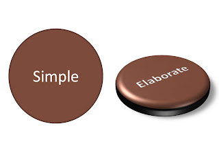
Try to resist it. Like with data charts, the fact that you have the ability to use sophisticated effects does not mean that you have to use them.

Oh, one more thing. If you hired a professional presentation designer, and the only thing she does is apply 3D and lighting effects to your diagrams, it is time to find another one.
