- Crammed in a small black box that blends in with the black frame of the projector
- A small font that can be read when sitting in front of a screen, but blurs away when viewed from a distance (when a presenter is explaining the chart)
- Unlike notes pages, the text appears on the slide itself (in PDF, in SlideShare)
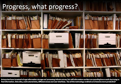
It's like reading a newspaper page:
- You read the small print under the images first
- You read the headlines after that
- You read the actual text last
An example below, click on an image to get a larger picture.
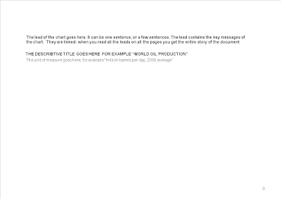
 Interestingly, this concept is very similar to the "lead" in the ancient McKinsey exhibit format.
  Another problem that would be solved by this is to make the information captured in a presentation searchable. In particular large knowledge firms (such as management consultants) struggle with archiving the knowledge that is hidden in PowerPoint presentations with little text.
