2009 - looking ahead in the world of PowerPoint presentations

It is the time of the year to look ahead. Here are some thoughts where the world of presentations and PowerPoint might go in 2009. A start for debate:
  • The bar is rising to make your presentation stand out. More and more people will get exposed to Presentation Zen and other books, more people will know how to find good stock images, and will be able to produce Zen-style presentations. 
  • People will recognize presentation design as a "serious" business discipline. Presentation gurus like Garr Reynolds will become general "business celebrities", who can reach audiences beyond those people who are just interested in graphics design or public speaking. They will be selling many books, doing many public speaking events, just like experts in other functions such as marketing (Seth Godin) . Congratulations Garr! This will further grow the tribe of people who want to change the world of business communication.
  • Slideshare will become the dominant online presentation sharing platform, defeating many rivals in this area. Big corporates will start using it to upload their official presentations (quarterly results etc.), pretty much in the same way that YouTube has become a mainstream platform for sharing ideas. Online presentation tools that rely on learning a new user interface will not be among the winners. 
  • Huge file sizes will drive more and more presentation development work and collaboration into the Internet cloud
  • Slideshare-style presentations meant for online sharing will become one of the most used formats. Almost too simplistic for my taste: "1 word a page", often accompanied by cliche stock images, to be clicked through at very high speeds, often abandoned mid-way. Better than bullet points, but not necessarly the best presentation form either.
  • Typography and fonts are tools that will be exploited more in mainstream business presentations, beyond the world of advertising
  • More daring creativity will be accepted in the (often "boring") board room. People suffer form information, PowerPoint overload. Using provocative images, formats, fonts, informal language (i.e., the techniques a billboard designer would use) will become acceptable forms of communication.
  • 3D will be used better, enabled by PowerPoint 2007, bringing "the technology to the masses" people will start to think how to use shadings, gradients, perspective in a way that is more than just adding a (useless) dimension to a bar chart
  • Data visualization is still relative virgin territory. More data is available. More processing power is available. It becomes easier to integrate things like maps. Etc. Etc.
  • Gradually doing away with the overhead projector heritage: one slide per subject, title in the top-left, source at the bottom. Instead slides will become more fluid as they transition into each other. New technologies enabling zooming in and out of areas will be leveraged. A great PowerPoint presentation become more similar to the supporting graphics that are often used in TV documentaries. 
My 2 cents. A healthy, peaceful, prosperous, and visual 2009 to all my readers.

Images with emotion - Flickr versus stock image sites

Stock images can be cheesy, staged, unnatural, cliche, especially when it comes to getting a shot of "real" people with real emotions. Try Flickr or other image sharing services as an alternative to stock image sites.
Here is a great, spontaneous and real image that caught my eye today. Look at the emotion in the girl's eyes, great light coming from below.
Original (in larger size) here on Flickr, picture taken by Studio Cougar. Always check copy right and license restrictions before using Flickr images in your presentations.

Too much - "painful graphics"

Before I argued that slightly irritating the audience's senses could support your presentation. Two cases of overdoing it:
More details about these ads on Ads of the World: Nycomed and Eurostar. I recommend adding this blog to your RSS reader.

A better solution for using custom fonts in PowerPoint

PowerPoint Ninja is essential reading for improving your technical PowerPoint skills.
The most recent post is about embedding non-standard or custom fonts inside a PowerPoint presentation so that you can be 100% sure your presentation will come out as you intended it when using on another computer. Custom fonts are a major untapped designer resource for PowerPoint presentations. Over the past years people started using a number of graphical tools in PowerPoint. First enabled by technology, then "abused", after which a "Zen-oriented" tribe of people developed the common wisdom about how to use each of them correctly, elegantly, and most importantly in such a way that it helped the purpose of the presentation
  • Bullet points
  • Colors (my pre-2002 presentations were almost all B&W)
  • Clip art
  • Boxes and diagrams
  • Animations
  • Images: Google image search, stock images
I think fonts and typography are next.

One more quick post: Kawasaki on Santa's perfect VC pitch

An example of a "perfect pitch" by Santa according to Guy Kawasaki. An overview (of more serious) web resources about writing pitch presentations to Venture Capital firms can be found here.

Visuals - 30 Christmas ads from around the world

Not much time to write elaborate blog posts over the holidays. Some interesting visuals on Digg Design - 30 unforgettable Christmas ads today (here is one to them):

Street art - "the secret of happiness is..."

I stumbled on an interesting street art project (more about creator "Elay"and more images here).
  • In the spirit of the season: happy holidays to everyone, and hopefully you have found the secret already or will find the secret soon.
  • The image is an example of how leaving stuff out (of a PowerPoint presentation) can stimulate your audience to fill in the details themselves. Like (good) authors of novels, film directors, etc. try to do.

Best of my little-known yet useful PowerPoint how tos

I have posted a number of PowerPoint how to posts over the past half year, but they disappear quickly to page 2. Here are some of them brought back to the front page:
I will update this on a regular basis.

Learn from psychology to design better sales presentations

I rediscovered an old bookmark of an excellent post on copyblogger today: "12 tips for Psychological Selling". The key idea here is that any purchase is an emotional decision, facts and logic come in second. 
The blog post is written with an online copy writer in mind, but some of these 12 tips can provide useful guidelines for PowerPoint presentation design as well. Especially for sales presentations, or even VC pitches for funding a startup. Maybe not every presentation is about selling something (a product, a company), in the end all presentations are about selling an idea.
  1. People make decisions emotionally
  2. People justify their decisions with facts. Combined with 1: the numbers and stats in your presentation are probably be used to post-rationalize an emotional decision. They are not the key decision driver
  3. Peole are ego-centric: what's in it for the PERSON you are presenting to (not just the company he is working for)
  4. People look for value
  5. People think in terms of people: real-life situations, social interactions, stories are better vehicles to get a point across than logic, data, and analysis
  6. You can't force people to do anything: convince them.
  7. People love to buy, people love to be sold to: HELP THEM do what they want to do
  8. People are naturally suspicious: add testimonials, maybe even a bit of hard data
  9. People are always looking for something: love, wealth, glory, comfort. Your presentation needs to link these desires with what you are trying to sell
  10. Not really relevant here
  11. People like to see it, touch it, feel it, taste it, smell it: good pictures, good diagrams, good demo screens
  12. Most people follow the crowd, again testimonials, your customer list, etc.
Many of these concepts also are discussed in the book "Made to stick". One of the most interesting factoids in this book (if I remember it correctly) is that it is actually scientificially proven that requiring to switch on the logical/analytical part of your brain literally turns off your desire to buy into a story.

How to speed up PowerPoint by switching off live preview

Live preview is the function that lets you see the result of an action (another color, another font, etc.) before you click it. Nice but a drain on performance. Here is how to get rid of it:
  • Go to the Office button (top left)
  • Select PowerPoint options
  • Uncheck the live preview box
(PowerPoint 2007)

"The coming end of the middle class"

Weekend reading/viewing. I got to this video by  Harvard Law scholar Elizabeth Warren via Twitter:
There are many "doom" videos and presentations out there at the moment, reinforcing the state of mind of the current economical crisis. This one stands out, and I sat through the entire 57 minutes (skipping the first introduction bits).
Elizabeth managed to make an exact like-for-like / inflation-adjusted comparison between the financial situation of families in the 1970s and the early 2000s. Her main conclusion: Americans haven't taken out all that credit to finance blind purchases of consumption goods such as cars, gadgets, holidays, etc. Some of the messages:
  • Per person income hasn't really increased over the past 30 years, women just started to enter the workforce, pushing household incomes up
  • Expenditure on items such as appliances, clothing, food (including restaurants) did not really go up
  • We did spend a lot more on housing ("parents are buying schools"), child care, healthcare, and college education
  • Risk has increased for the highly leveraged 2-kid family: illness, divorce, job loss
This blog is not about economics. But from a presentation perspective, this video is worth watching. The slides are strictly statistical, poorly formated, almost resembling a 1990s overhead sheet, the speaker does not move, still the story is truly captivating. Captivating because many, many people (me included) are looking for the answer to the issue Elizabeth is raising. We just want to stay until the end to find out.
Another example of why giving everything away on page one of your presentation is not always the right thing to do.
The video was recorded on 8 March 2007, added to YouTube on 31 January 2008, but very timely to watch in December 2008.

Graffiti and crossing things out with a red paint brush in PowerPoint

Crossing things out in an immaculate PowerPoint slide with a rough, red paint brush can make a point strongly: "with our technology you can skip buying that new server"
I use a simple PowerPoint 2007 "glow" to get a graffiti-style effect. In the image below, I selected the "Boopee" font (standard in PowerPoint 2007) to which I applied a red glow and a gradient text fill (bright red, with a darker red). The background image was purchased on iStockPhoto. Let me know in the comments if you need more detailed instructions.
The French are just so good in inventing words: "taggeur" for graffiti artist (or vandal). Brilliant.
Be sure to avoid setting yourself up for disaster when using non-standard fonts in a PowerPoint presentation.

Create your own buttons and lights on a metal skin in PowerPoint

Inspired by a post on slide:ology today linking to a set of newly released PowerPoint templates with examples of what graphical effects PowerPoint can produce, I decided to start posting some of my own favorites.
Many logos of Web 2.0 companies are examples of how not to use these graphics capabilities: add a "bevel", "reflection" and "drop shadow" and the result must look good. In graphics design, most of the time, less means more.
But sometimes these effects can help. In my case a client needing to explain software functionality. We decided to go for the metal "HiFi component" look with buttons that can easily activate functions. (Click image for a larger picture)
  • Metal skin: an image purchased from iStockPhoto
  • Metal text: a big font in a similar, but slightly darker color than the background with an interior shadow applied to it
  • Button 1 and 2: a circle with a heavy outline (red or black), a simple "bevel" applied to it, but in the tab "3D options" of the bevel functionality I increased the depth to 20.
  • Light 3 and 4: a circle without an outline, with an central interior shadow and a color gradient running from a full color to a slightly faded color.
Let me know in the comments if you are interested in the detailed instructions.

Bleeding edges - you can use them both for images and text

A "bleed", or "bleeding edge" is a page with a graphic extending over the edge of the page. I like to use them a lot in PowerPoint presentations.
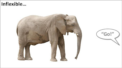
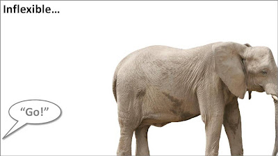
Take the following example. When the elephant is positioned in the middle of the slide, the composition is not really interesting. Have him walk off the page and insert a bit more white space makes it a lot more interesting (our friend just stands there, ignoring all things around him).
Pushing things a bit further, you can use the same technique for words/typography as well. The brain does not always need clean typography to be able to read. You probably remember this text (I do not know who wrote it, or whether the research actually happened):
i cdnuolt blveiee taht I cluod aulaclty uesdnatnrd waht I was rdanieg. The phaonmneal pweor of the hmuan mnid, aoccdrnig to a rscheearch at Cmabrigde Uinervtisy, it dseno't mtaetr in waht oerdr the ltteres in a wrod are, the olny iproamtnt tihng is taht the frsit and lsat ltteer be in the rghit pclae. The rset can be a taotl mses and you can sitll raed it whotuit a pboerlm. Tihs is bcuseae the huamn mnid deos not raed ervey lteter by istlef, but the wrod as a wlohe. Azanmig huh? yaeh and I awlyas tghuhot slpeling was ipmorantt!
An example of letting words "bleed" off the page (I used to highlight problems with current solutions in the market for a client in the technology sector):
In print, you create bleeding edges by printing on a piece of paper that is too big, excess graphics are cut off later. In the digital world, this is a lot easier: crop the parts of the picture you do not need.

More 3D: positioning text with a reflection in PowerPoint

On today's SlideShare front page is a nice presentation by Martin Pure:
Marketers See Think Wonder
View SlideShare presentation or Upload your own. (tags: marketing change)
Following on yesterday's post on 3D objects, you can see that "something is wrong" with the alignment of the objects. The use of a reflection (a "Web 2.0" effect that I only use very rarely) implies a 3D setting.
You can apply the same guide lines thought to correct things. In addition, you can change the size of the font to emphasize the feel of a 3D environment.
My comments were all about positioning of text. Do not misunderstand me, I like this presentation.

SlideShare ribbon for tight integration into PowerPoint

Today, SlideShare launched a ribbon for PowerPoint, integrating its functionality more tightly with the desktop office application.

How to position 3D objects in PowerPoint slides

I am not a big fan of heavy 3D graphics in PowerPoint. Similar to animations, or 3D bar/column charts: the fact that PowerPoint enables you to do it, does not mean you have to use it.
  • It is tricky to get things to look realistic: PowerPoint is not a 3D design tool. A failed 3D chart looks very amateurish
  • 3D charts make it almost impossible to work with images. If given a choice, I would use an image rather than 3D objects. You can't have them both.
  • 3D is hardly ever required to make a point: less is more in good PowerPoint design. Exceptions to this rule could be things emerging at the horizon, long-term outlooks, etc.
  • Text becomes harder to read
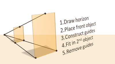
If you do want to use a 3D composition, use guide lines and an imaginative vanishing point to make sure your objects are aligned properly.
UPDATE: more on positioning text (with reflection) in 3D in PowerPoint in a folow up post to this one.

How to set a non-standard color in PowerPoint - HSL codes

You can fill books about color theory, here I will take things one step at a time. How to set a non-standard color in PowerPoint?
First of all to enter the right menu: hit any fill, outline or font color drop-down and select "more colors". A big rainbow-like display will open. (Click the image above for a larger picture.) You have 3 options:
  1. Manually move the mouse in the color grid and click a color: this is never accurate enough. (Tip, you can actually stretch the window to make your selection more precise)
  2. Use RGB codes: a value of 0-255 for (R)ed, (G)reen, and (B)lue: it is impossible to predict what the resulting color of an RGB-combination is
  3. Use HSL codes, my favorite. Let's elaborate.
In the "color model" box at the bottom left of the matrix, change "RGB" to "HSL".
You can define a color exactly by changing the 3 variables, each ranging from 0 to 255:
  • (H)ue is the position of the color on the spectrum, going from red all the way to purple
  • (S)aturation determines how bold are faded your color will be. Fluorescent colors go for the full 255, pastel colors for a low value, if you make the value really low, all colors turn more or less into grey
  • (L)umenance sets the shade of the color, from light to dark
In practice I hardly ever use this technique to set my PowerPoint presentation color scheme (see a previous post on how I do this). There are situations though you might have to use the HSL color model:
  • Micro-adjust colors: "a bit more yellow in the orange" (more hue) to fine tune colors. Or to define clashing colors on purpose: create a second colors just a few nodges away from the original on the hue spectrum.
  • Create color shades: I use lumenance a lot, it gives an almost endless array of color shadings that I can use in my designs. PowerPoint 2007 gives a standard spectrum of shadings in its default color menu, but if you run out, you can manually adjust the lumenance to get an even larger amount of colors to work with.
  • Toning down light, bright colors. Highly saturated colors do not look good when you increase the lumenance. To have beautiful light shadings of these colors you need to take down the saturation.

Back to basics: going analogue using the pencil (+ a bit of self-relativation)

A nice presentation by cartoonist Betsy Streeter on the front page of SlideShare today: Two "so whats" for me:
  1. Go back to the pencil when designing presentations. Sketch, erase, sketch, sketch again. A much better creative tool than opening the PowerPoint standard template. Design your slide offline, PowerPoint is a production tool to get your original idea in digital form. Nothing more.
  2. A bit of self-relativation: it is amusing to see how professional presentation designers (ME INCLUDED) increasingly resort to using "back to analogue" techqniques to make their point. We've come full circle when we start pasting 10MB high-res scans of a piece of paper, a sticky note, etc. into PowerPoint.  Why not bring the physical flip chart page to the presentation event and leave the laptop in the office? This reminds me a little bit of the joke of the investment banker who worked 100 hour work weeks to retire at 45 and settle in a Mediterranean village to spend the day fishing. His fellow local fisher man has been doing this since he was 15 without going through the trouble. (A better, longer version of the joke here).

Presentation shortcut: "scientists extract images directly from brain"

Presentations are all about brain-to-brain transfer:
  1. Idea in presenter's brain
  2. Idea transferred in presentation
  3. Idea in audience brain (hopefully)
Japanese scientists are working on the shortcut: extracting images directly from someone's brain(!)
There are some ambitious objectives for future research:
  • Read someone's dreams
  • Read someone's thoughts
  • And: "read [someone's] feelings and complicated emotional states"
Until now, it has been very difficult to transfer feelings and complicated emotional states in a PowerPoint presentation. You had to resort to writing a novel for that...

From 2x2s to 4x4s - heat map to visualize trade-offs

Not a grand presentation design insight today, but a quick sketch.
Matrices such as 2x2s are often over-used. When you combine them with a heatmap, some colors and some gradients, you get a nice visualization of a trade-off:
Update: to show that the big lines are not grid lines, here are the 3x3, 2x2 and 1x1 versions of the same chart:

Preserving custom fonts when presenting away from your own computer

Complex, custom fonts can be beautiful. Seth Godin even recommends everyone to buy their own as one of his 9 steps to PowerPoint magic.
One problem, custom fonts are a disaster when used on a machine that is not yours. And you discover it when you click through slide 2 of your presentation in front of  a live audience...
Therefore, I won't use them as my default font in a presentation, but only in specific pages. Here is the trick:
  • Make a copy of the original (editable) slide and put it in the back of the deck, you don't wont to lose the original
  • Group all elements of the original slide into one object
  • Cut it (CTRL-X)
  • Paste special as "PNG"
The whole slide has been transformed into an image which for sure will show up correctly on whatever computer you are using.
UPDATE: POWERPOINT NINJA SHOWS A MUCH BETTER SOLUTION. HOW TO EMBED CUSTOM FONTS IN POWERPOINT: LINK
Background image purchased on iStockPhoto. Font used is Palace Script MT, built into PowerPoint 2007.

"Burning" typography that almost hurts the eye

I am more and more fascinated by design lessons from consumer advertising billboards. Take this ad for Tango (a UK soft drink):
First of all the message. Confident, huge font, but the reader will discount the message completely "yeah right". But it makes you think.
Then the typography. It almost hurts. Like watching a broken television screen. The onset of a migraine aura. Looking through the corner of your glasses and see how the lenses distort colors because of light refraction.
I argued before that slightly irritating the senses of your audience can help get your message across.
How did the typographer (Chris Chapman) do it? Clashing colors. Full orange background. Bright red shading. Colors that are very close on the color spectrum, but not similar. Like hitting 2 adjacent keys on a piano (harmonic dissonance). Grunch letter fill (hard to imitate in PowerPoint).
More on working with color wheels in a later post.
UPDATE after a comment. People should not misunderstand me. Any dissonance effect should serve a purpose. Simply screaming out a message does not make it stick. However, certain "painful" situations can be supported by a (one) "painful" chart.

One Lego visual - 2 insights about leveraging imagination

I found this great Lego ad yesterday on SlipperyBrick:
Sometimes relying on audience imagination can work, sometimes it does not.
  1. Sometimes it can work. Although adults might lose some of their imagination capabilities over time, it is still possible to get across visual messages with very simple graphics. Simple shapes, simple cartoons, even just creative typography. The mind will fill in the missing pieces
  2. Sometimes it does not work. The book Made to Stick introduces the concept of Curse of Knowledge. The presenter "hears"/imagines a tune in his head and taps it with his fingers on the table. All is perfectly clear to the presenter. All the audience can hear is.... someone tapping. 

Chart concept: the 2x2 matrix and other grouping techniques

McKinsey and other management consultants love 2x2 matrices (and obviously 3x3s). Personally, I think they are often overused (framework overload).
Not every categorization can be crammed into this framework.
  • The axes need to be logical
  • The groups needs to lead to 4 categories, i.e., leaving one or two boxes as "not applicable" does not make sense
  • They work particularly well when you want to show things moving from one category to the other
  • They are good to show that something stands out (from for example the competition) by popping up in the top-right corner
Here are some other techniques to group items on a PowerPoint slide using line and venn diagrams:
  • Diagram 2 - "you cannot have it both ways"
  • Diagram 3 - "the best of both worlds"

Weekend reading: 127 RSS feeds about design

Creating PowerPoint presentations is all about design. 
The COLORBURNED blog author shared the content of his RSS reader in this post with a list of 127 RSS feeds "that all designers should subscribe to" (the comments add a few more).
Not sure whether I will do that, but it does provide some good weekend reading.

Chart concept: "fast forward" - a good summary chart is like a good headline

Putting a summary slide as page 1 in your PowerPoint presentation is tricky.
  • A diluted and boring summary might turn the audience off ("let's check email on my phone")
  • A summary chart might "give away the point" of your presentation too early
  • Some presenters might get stuck on page one and tell the whole story without using any other slides (sometimes this can be a good thing, a presentation with PowerPoint)
A good page one is a slide that gives the audience some clue about what's going to happen and presents an interesting teaser about what is to come.
Now that I come to think of it - a good summary chart is like a good headline
The following image (purchased from iStockPhoto) adds another possibility to presentation opening concepts I discussed before (here, here, and here). "Let's fast forward to the end before diving in". Shrink the image to one side of the screen and add your teaser in big-font-text

Funny - video about cliche stock images

Great images can do amazing things to your PowerPoint presentation. But, cheesy stock images are as bad as poor clip art. The Empower Your Point blog dug up this amusing video on the subject:
There are no golden rules here. In practice I find that any image that is not "natural" usually does not pass the bar: renderings, staged compositions with models (exception: children), combination of 2 or more images (you can do that yourself). Related posts about this issue here, and here.

Be consistent - $s, Euros, millions, bns, GBPs, 000s

There are many ways to spell monetary amounts. Pick one and use it consistently throughout your PowerPoint presentation:
  • $, US$, USD, I actually like these 3-letter abbreviations, no searching on keyboards, no need to search and insert symbols, every currency has one that looks consistent
  • Billion, bn
  • Million, M, m
  • 000, thousand, k
  • Decimal point, decimal comma
  • Thousand separator point, comma, or none
  • Negative number with "-", or in between brackets
Unfortunately, detail does matter in presentation design...

Using "paste as PNG" to wash out complex PowerPoint objects

Going a bit (only a bit) against the "Zen" presentation philosophy, I have argued before that overwhelmingly complex PowerPoint charts could be used in a large keynote presentation, if (big if) they are positioned well.
One way to use it is as follows:
  • Put up the overwhelmingly complex chart, message: "it's complex, don't even try to understand this now"
  • In a subsequent chart, wash out the original object
  • Start highlighting individual components for further explanation
You can use the "paste as PNG" function in PowerPoint to transfer any object (including complex groupings) into a picture and subject it to the regular picture manipulation tools available to you: resize (a pain for complex PowerPoint objects with text in them), crop, and of course re-color.
Recoloring the image with a very light overlay creates a wash out effect that you then can use as a background for subsequent highlights. I have tried to explain all this in the following SlideShare presentation (click on "screen" image at bottom right for full screen mode).